Wednesday 6 November 2013

Ceramic bowl.


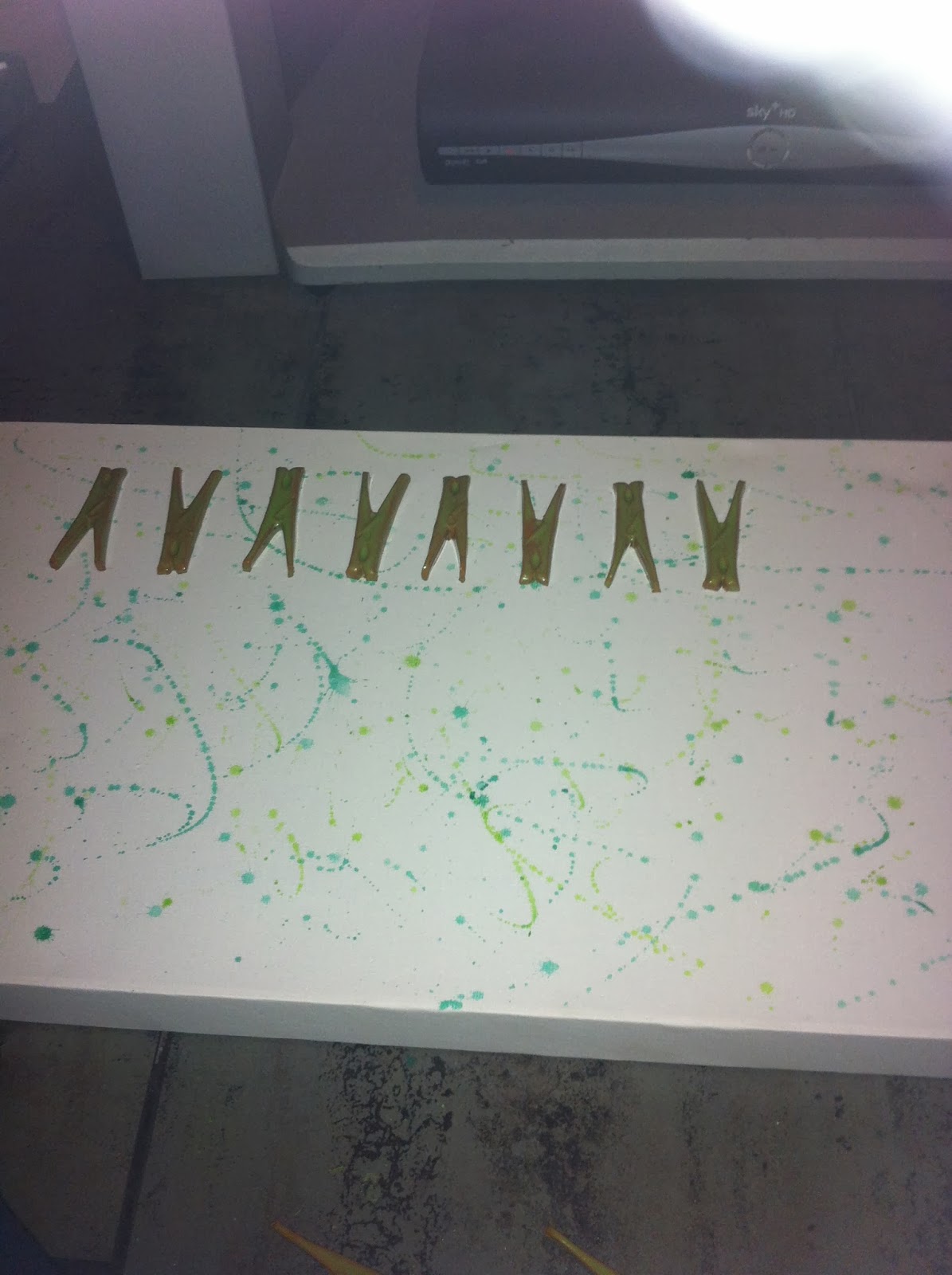
   These are samples for the bowl I created. I found that I really wanted to use text in my piece because I find it looks nice on clay. I created these samples to see what it would come out like with the white slip on top of red clay. I really like the one that has loads of different fonts etched into it I find that is the one that worked the best out of the three.  
These are my samples after I glazed them. For the purple piece I wish I had used a clear glaze because underneath I really nicely blended together a green stain, magnesium oxide and copper oxide. however because I used the purple glaze you can't really see it which is disappointing.
     I like the colour of the glaze I used on the oddly shaped one. I used matte sun yellow glaze but I only used one layer so you can still see where I have stained the scrafitto underneath. The bottom right hand corner is my least favourite because all I used is a stain and a clear glaze, however, the top right piece is also just stain and clear glaze but I really like how this one turned out. I feel its because of the range of fonts and the fact I applied the glaze properly.


   This is how my bowl looked before it went into the kiln. I like the design around the edges of the bowl, however, I don't like the drawings I have done in a circle in the middle. I think if I had not made my design as circular as I have then it would of looked better. I so like the letters i have stamped in the middle I find it pulls the piece together. I still like how it has come out though I think as a piece it is very nice. 
 After it going into the kiln I used a green stain to colour in the images and rub into the text and blended it in. Then I applied a clear glaze, cleaned the underneath and put it back in the kiln. Personally I like my outcome and think I did a good job.


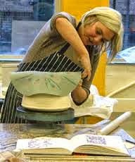
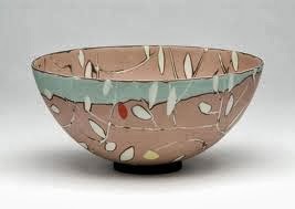
While creating my bowl I came across this ceramicist Susan Nemeth. She caught my eye because instead of using the spinning wheel to create her bowls she uses the technique I used with a press mold. I find this technique interesting; however, I found it nerve racking because I thought the bottom wouldn’t come out as well as I’d hoped and you don’t see the bottom until the end of the process. I still enjoyed created this piece and I will definitely use the technique again in the future. 


Ceramic Pieces.


In ceramics my tutor said that we could make whatever we wanted, so I made a series on items. The first is one of my objects created out of white clay and the object is an energy drink can. I started by moulding the general shape of the can like the cylinder and the lip at the top. I also did the pull tab at the top. After this I cut through the bottom of the shape with a wire and hollowed out the whole thing then scoured and slipped it back together while trying to make the seam unnoticeable which I find I succeeded. After I hollowed and sealed the piece I find that this has warped the shape of the can but this also makes the can look like it has been slightly crushed which I find works however I would prefer if it was more straight. Later I used paper guides to get crisp lines of green decorating slip on the front. Then I left the piece to the side to dry to about leather hard then I carved away the design of the can into the slip, this technique is called Scraffito. Then I punched the top of the can and used soft tools to make the opening of the can neat and clean.


This is the piece after being fired.
This is the piece after I added clear glaze.


Later I made two more pieces. These were two slab built matchboxes. I started with rolling out clay with guides, rolling pins and a board. Then I measured out pieces of clay equally to make sure they fit into a box shape.


Then I started connecting the slabs by scouring and slipping them together. I used a wooden tool to smooth off the seams. This is the hardest part I find of the development, you can see on the final product that my seams aren't the best but I think they are acceptable.


 I later made a draw to fit inside the matchbox with three little matches inside with the same green decorating slip I used for my can.


Later I used paper guides again to place the matt white glaze and green decorating slip onto the box. After it had dried for a while I used scraffito to carve "Safety Matches" into the surface. Then I displayed them altogether and photographed.
After creating the first matchbox I created another one half it's size. However because it was so small I couldn't make a small enough draw to fit inside so I just slide two more clay matches into the box. I decorated it the same way as the first box.

This is what they looked like after being fired. The white part is glaze so that has come out shiny and smooth however the green slip is still quite rough but I don't think it looks to bad. The white has also come out an orangey tint which i am not sure why this has happened but I like the way it makes them look a bit worn and aged. 


My final object I created is made up of several parts. First I had to make the clay mold of a few of my objects. I chose a drawing pin, a peg, a headphone aux cable and a part of my watch.
I rolled out the clay using guides to get it absolutely flat and then I covered my objects in oil and proceeded to make prints of them. For the smaller objects I had to use a soft tool to get it back out of the clay therefore not damaging the surrounding clay.

Once the mold had been fired I made multiples of the moulds but in negatives. instead of them being in the clay they are raised out of the clay. To make these multiples I got small pieces of clay, used a rolling pin to make them flatter them simply pressed them on top of the mould to get the negatives. I weighed them down with guides so they wouldn't curl and then left them to dry.  

Later I added semi transparent 'Apple Green' glaze to my clay peg pieces. This is how they came out.
I like the way they have come out because you can still see the colour of the clay underneath which I find looks nice with these mini pieces.


These are my clay drawing pins and headphone AUX cables. This is when green stain was added to the headphones and green decorating slip plus clear glaze was added to the drawing pins. However this is before they went into the kiln. 


Later I bought a landscape canvas and splattered paint onto it using watercolours and various different greens. Then I used super glue to join the ceramic to the canvas. After re glazing my pieces I find they look much better and I am very happy with my final outcome. I like how they are all arranged neatly and evenly and i find the glaze makes them look a lot more professional. I also love the rough edges around the drawing pins and AUX cables because they also make the smooth edge pegs pop out more. 


Graphics project.

Peter Blake


                This is the beginning of the research I have done for this project. Peter Blake has been used a lot in this project because his work is very similar to the project I am doing with small items. I also like using his work in research because I love how he produces art I think a lot of his work is amazing.

            This project is about collections and producing a piece of work on our collection of items. Blake has produced a lot of collections in his work, for example he has done a whole piece per letter of the alphabet. I love how he has laid out his work and I would like to try the same sort of thing on my project.
      http://ivanhoebooks.blogspot.co.uk/2008_10_01_archive.html
      
                                                                        Lisa Milroy


 Lisa Milroy is another artist I came across who does the same sort of thing with collections. The difference is that instead of making sculptures and photographing them, she draws the collection instead. Some of her pieces consist of loads of different items like the first one with scissors but other times she’ll just draw the same item multiple times over in a row or at angles. I find this interesting and I have never seen anyone do it before. It is original and I like her style of drawing, it is very realistic. The ones I don’t like that much are the ones where they are cluttered, I like the individual ones because they look more like a photograph and you notice the talent of the drawing more. When they are all overlaying each other I think it looks more like drawings and therefore not as interesting.
      http://www.lisamilroy.net/


I started photographing my collection with different characteristics in groups. For example there’s small items, made of material, wooden, circular and loads of different combinations. I also photographed every item individually to make a collage in Photoshop. 
       This is a collage of images I created on Photoshop. To create this affect I used the layers Hard Mix, Subtract and Difference. I left one image un-edited so it would stick out amongst the rest and to show the different against the edited ones. 

Layers ; Divide, Exclusion, Subtract.


On this I changed the brightness and sharpened the images.

This is where I started experimenting with the saturation and hue to change the colours.


This is an effect I like, I used overlay which the same image except changing the scale. Then I used the layer divide to get the strange colours.

The below images are my final outcomes. 


These are the final outcomes I have produced. I started by photographing my objects separately then overlaying loads of different photos over each other to get this sort of blocky effect. Then after this I change the saturation and hue to change the colours and not affect the photographs. I do like my final outcomes and I plan on printing them out in A1, however, I wish I had edited it more to make the objects more defined.